
Colour Drenching:
FOLLOW US – click the following links – INSTAGRAM, YOUTUBE, TIK TOK or LINKEDIN
Transforming Spaces with Bold and Subtle Hues I recently had the pleasure of joining Sinead Ryan on The Home Show on Newstalk to explore the world of colour drenching—a design approach that’s gaining momentum for its bold, immersive effect.

We covered the dos and don’ts, the role of saturated colours, neutrals and greige, the best way to paint archives and mouldings, and even the unique challenges of painting an attic room. Whether you’re looking to make a dramatic statement or create a soft, enveloping atmosphere, colour drenching is a technique that offers versatility and impact. Here’s what you need to know to master this approach.colour drenching.

What is Colour Drenching?
Colour drenching involves using one colour across all surfaces in a space—walls, ceilings, doors, trim, and even furniture. The result is a seamless, sophisticated aesthetic that eliminates visual breaks and enhances architectural features.

The Dos and Don’ts of Colour Drenching

✅ DO choose the right colour for your space. Saturated hues like deep blues, forest greens, and rich ochres create a dramatic, intimate feel, while neutrals and greige offer a softer, more subtle take on the trend.

✅ DO use one matte finish for all surfaces. A consistent finish enhances cohesion and prevents distracting variations in sheen. Matte finishes also add depth and absorb light beautifully, reducing glare.
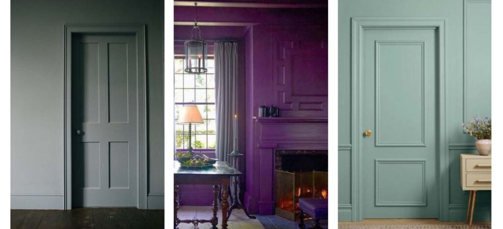
✅ DO incorporate architectural details. Archives, mouldings, skirting, and cornices should be painted in the same colour to create a harmonious, uninterrupted flow.

❌ DON’T break up the scheme with contrasting trim. A unified look is key—keeping all elements in the same hue prevents visual clutter.
❌ DON’T overlook lighting. Natural and artificial light will influence how the colour reads in a space, so test swatches at different times of day.
How to Use Neutrals and Greige in Colour Drenching
For those hesitant about deep, bold shades, neutrals and greige offer a more understated yet equally impactful approach. These hues create a warm, sophisticated ambiance while maintaining the enveloping effect of colour drenching. They work particularly well in period homes, modern spaces, and areas where you want to achieve a timeless aesthetic.

Painting an Attic Room: Dos and Don’ts
Attic rooms come with unique design challenges, from sloped ceilings to limited natural light. Here’s how to make colour drenching work in these tricky spaces:

✅ DO use the same colour for walls and ceiling. This prevents the space from feeling chopped up and visually expands the room.

✅ DO consider a lighter or muted tone if the space has low ceilings. Darker colours can feel cozy, but in a compact attic, they might be overwhelming.
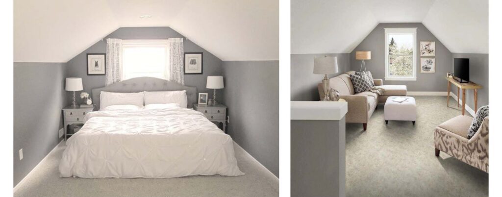
❌ DON’T use high-contrast paint on beams or architectural angles. Keeping everything in one colour creates a sense of openness and continuity
.
The Power of a Unified Colour Scheme
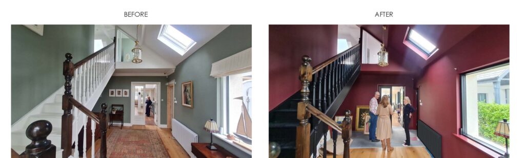
Colour drenching is more than just a trend—it’s a transformative approach to design. Whether you go bold with deep, moody hues or subtle with soft neutrals, the key is commitment. By embracing a single colour in a matte finish, integrating mouldings and archives into the scheme, and understanding how light and architecture interact with colour, you can create a space that feels intentional, immersive, and effortlessly chic.

It was a pleasure discussing these ideas on The Home Show, and I hope it inspires more people to experiment with this dynamic approach to interior design!